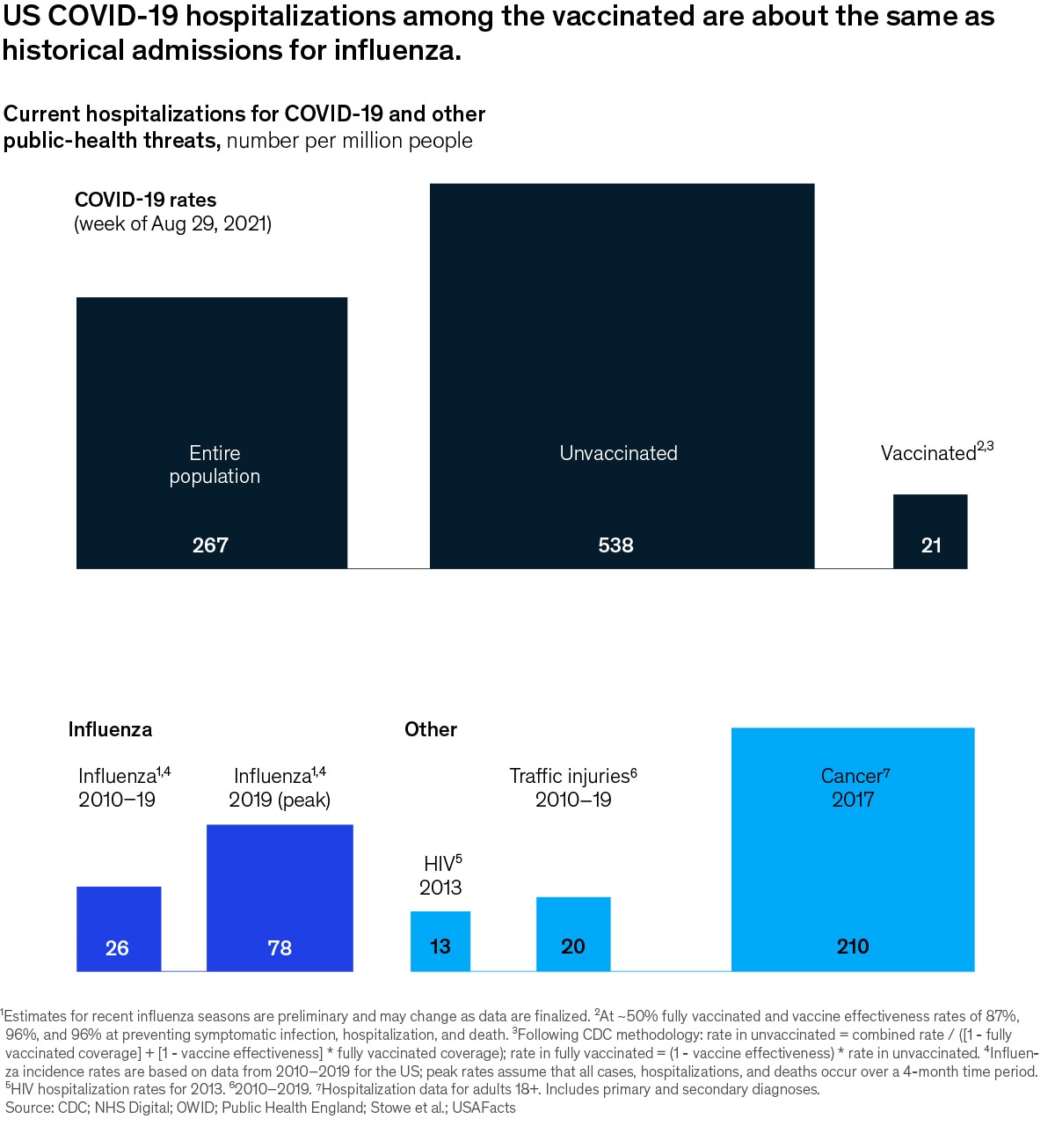
| ALL THE WEEK’S DATA THAT’S FIT TO VISUALIZE | | | Our Charting the path to the next normal series offers a daily chart that helps explain a changing world—during the pandemic and beyond. In case you missed them, this week’s graphics explored the current state of COVID-19 hospitalizations, residents’ perceptions of their local transport systems, why agile could be a boon for manufacturing, why women are leaving the mining industry, and the expected significant increases in R&D investment in China. | | FEATURED CHART | | COVID-19 hospitalizations: Where we are now |
| | This week’s other select charts | | | Get our editors’ weekly picks of the five McKinsey charts that help explain a changing world—delivered to your inbox each weekend. Subscribe | | | Did you enjoy this newsletter? Forward it to colleagues and friends so they can subscribe too.
Was this issue forwarded to you? Sign up for it and sample our 40+ other free email subscriptions here. | | | This email contains information about McKinsey’s research, insights, services, or events. By opening our emails or clicking on links, you agree to our use of cookies and web tracking technology. For more information on how we use and protect your information, please review our privacy policy. | | You received this email because you subscribed to our Healthcare Systems & Services alert list. | | | | Copyright © 2021 | McKinsey & Company, 3 World Trade Center, 175 Greenwich Street, New York, NY 10007 | | |