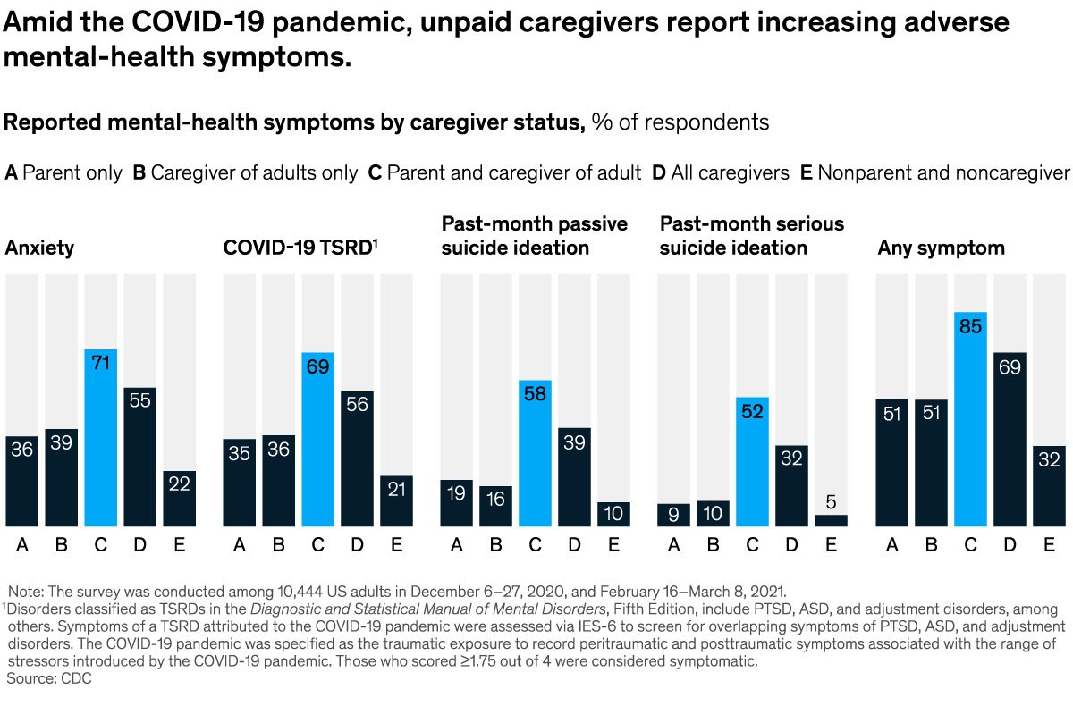
| ALL THE WEEK’S DATA THAT'S FIT TO VISUALIZE | | | Our Charting the path to the next normal series offers a daily chart that helps explain a changing world—during the pandemic and beyond. In case you missed them, this week’s graphics explored the cohort with the highest rate of mental-health symptoms, decline in global payments revenues, transport infrastructure spending, the time organizations required to implement changes during the pandemic, and the digital future of medtech marketing. | | FEATURED CHART | | American “sandwich generation” caregivers suffer the most |
| | This week’s other select charts | | | Get our editors’ weekly picks of the five McKinsey charts that help explain a changing world—delivered to your inbox each weekend. Subscribe | | | | This email contains information about McKinsey’s research, insights, services, or events. By opening our emails or clicking on links, you agree to our use of cookies and web tracking technology. For more information on how we use and protect your information, please review our privacy policy. | | You received this email because you subscribed to our Healthcare Systems & Services alert list. | | | | Copyright © 2021 | McKinsey & Company, 3 World Trade Center, 175 Greenwich Street, New York, NY 10007 | | |